Showing posts with label Tutorials. Show all posts

Friday, May 1, 2009

18 jQuery scripts and tutorials to improve portfolio

For freelancing designers, the online portfolio is one the best ways to get some work. Every prospect will check it before hiring you for the job, so it must be good. JQuery can be a great tool to improve your portfolio, whether it’s for eye candy, usability or functionalities. In the following collection you will find some great jQuery scripts and tutorials that’s help you to get a better portfolio


1. jQuery tabs


Tabs can be a great way to make informations about a project quickly available without leaving the page. For example you can insert project details in a secondary tab because you know that only a few visitors will have interest in it.


jquery tabs


2. jQuery cycle


If you want to show a project’s evolution, jQuery cycle could be the way to go. It is basically a slideshow with cool transition effects, and the ability to use different actions to move from one slide to another.


jquery cycle


3. Coda Bubble


If you are going to use a tooltip to display further technical informations, do it with style. This script and tutorial teaches you to create a bubble just as pretty as the ones on Coda’s website.


coda bubble


4. jQuery Zoom


If you have designs where the details have a lot of importance, you should use this script to let your site’s visitors know that you don’t neglect details in your designs.


jquery zoom


5. Flip Box


Nice flipping effect for your divs, images, or whatever you want to put in it.


flip box


6. jQuery Multimedia portfolio


A cool carousel jQuery that allows you to display different media types, perfect for multimedia designers.


jquery portfolio


7. Coda slider


If you read a lot of web design blogs, you’ve probably seen this one over and over. I still could not leave it out of this list as it’s a great way to display design work.


coda slider


8. Kwicks


Nifty little effect for menus, can also be used for other things if you are creative (and I am sure you are).


kwicks 18 jQuery scripts and tutorials to improve your portfolio


9. jQuery Treeview plugin


If you have a lot of projects and designs to show, this could be the right navigation to use for your portfolio.


jquery treeview


10. jQuery filterable portfolio


Excellent tutorial to create a filterable portfolio with jQuery.


jquery portfolio filter


11. LavaLamp menu effect


Beautiful menu effect that captures your attention towards the menu element you are hovering.



lavalamp menu


12. jQuery Calculator


Want to get rid of people with too low budgets? This could be the way to go. The jQuery Calculation plugin could allow you to give an estimate of what their request will cost.


jquery calculator


13. jQuery form validation


Tired of receiving incomplete form submissions from your portfolio site? Try the jQuery form validation plugin and the people trying to contact you will not be able to send a message if they didn’t fill in the form properly.


jquery validation


14. jQuery Accordion menu


In your portfolio you will probably want to emphasize on your content and images. Accordion menus can be a good way to declutter your sidebar and give more space to content.


jquery accordion


15. jQuery sequential list


It’s good to explain your workflow on your portfolio website, it gives your potential clients a good indication of what they can expect when working with you. Using a sequential list is a good way to do this, learn how in Web Designer Wall’s tutorial.


jquery sequential list


16. jqTransform


Good form styling does not only look nicer, it’s also often more usable.


jquery form styling


17. jQuery Virtual Tour


If you are really proud of your studio, you can give a good feel of what it looks like with this virtual tour jQuery plugin.


jquery virtual tour


18. jQuery Image Notes


To give informations about an image or project, image notes are the perfect solution. You can easily point out details and give in-context explanations.


jquery image notes


Read more...

Thursday, April 30, 2009

Principles of Good Design for Websites

4-principles-lg


One of my absolute favorite design books is, Robin Williams Design Workshop. It looks into practical design theories and showcases awesome examples. One of the areas of focus that I’ve taken into all my designs are the four major design principles. They include: contrast, repetition, alignment, and proximity.


This post will discuss those four principles as they relate to web design. By keeping these design theories fresh in your mind, you will be sure to design cleaner, more aesthetically pleasing sites.


1. Contrast


Great contrast can leave a very good first impression on a user. Without a focal point, the viewer is generally lost in a sea of equally-sized elements and typography. It’s the designer’s job to create visual elements of significance that guide the user’s experience. You can achieve great contrast on your site by choosing your images, colors and fonts wisely.


Contrast With Images


It’s often very effective to showcase a large illustration next to smaller elements. Here’s what I mean:


The Invoice Machine


This site utilizes a large image to bring in the reader’s attention. Also the monochromatic nature of the site allows the limited use of blue to play a bigger role.


invoice-machine1


Instabox


Do the eye test on this site. What do you notice first? More than likely it’s the star on the box. Just like The Invoice Machine, they’ve created a focal point using a large image and limited color.


instabox1


Contrast With Colors


Sprinkling in color at just the right amount is another way to create effective contrast within a website. It can be created using a different color in headers and text copy, as well as within the colors of an image or illustration.


Fatburgr


This site is a fantastic example of almost all of the design principles. For color contrast take a look at the large yellow header versus the smaller light gray copy. Alignment, image contrast, repetition and proximity are all strong throughout.


fatburgr


I Love Typography


Is it any surprise that a website built to showcase typography would give us a great example right in its own header? I love their font choice and how the green color plays nicely off the darker gray.


i-love-typography


Contrast With Fonts


If you are trying to create contrast with fonts you should avoid using two very similar font faces and sizes. The similarity of the fonts tends to create confusion and blur the design. However, it can be very effective if you make the font sizes very different, or mix the lightest version of the font in combination with the boldest. Also, you’ll be surprised at the visually impressive combos you can create by using two very different fonts in tandem. For instance a san serif font with a hand-written font.


Fixie Consulting


Wow! I love the typography and colors on this site. Check out all the size and stroke variations on their slogan. I also love the grunge that is sprinkled in, and the limited use of blue.


fixie-consulting


2. Repetition


Repetition in print design is much more common than it is in web design, however it can be equally effective. Repeating design elements helps create a consistent look and improves branding. In web design a great way to achieve this is by repeating elements in the header and footer. Check out a couple of examples below.


Ten24 Media


Ten24 Media uses a creative grass illustration in both the header and footer.


ten24-media


Silverback


This site is just awesome! I definitely could have showcased it in the contrast section, but it works just as well here because the theme and branding are clearly used throughout. Check out the use of the bananas as bullets, and the forest illustration at the header and footer.


silverback


3. Alignment


Alignment plays an intricate role in taking your site designs from looking amateur to professional. I’ve recently become a huge advocate for designing sites using a grid. Doing so cleans up your designs and gives you an awesome framework to work from. If you’re interested in learning more about designing for a grid, check out my recent post (insert shameless self promotion here), Design A Fresh Blog Theme On The 960 Grid.


Black Estate Vineyard


This site is showcased on the 960 Grid website. It’s alignment is consistent and striking. I love the way the main content is left justified and flush in its column, however some of the larger level headings break the rule and shift into the left sidebar. They also do a good job with generous amounts of white space and contrasting sized fonts.


estate-black1


A List Apart


A List Apart features a visually obvious grid. The columns are well defined and contain everything in very readable chunks. Studies have shown that really wide columns drastically reduce readability. Your eyes will get tired when trying to follow text across wide column widths. A List Apart also features a fantastic article that argues, Good Designers Redesign, Great Designers Realign.


a-list-apart1


4. Proximity


The last principle is proximity. This has to do with grouping like elements together and separating those that are not. It can really ruin user experience if you group everything into one lump text block. That’s why its very important to use header tags and proper spacing.


Envato


This site does a beautiful job of organizing it’s content into three major categories. They are well spaced and clearly defined.


envato


Paradigm Reborn


This site is well structured. The headers are clear and concise. The spacing is good and the content is separated into logical chunks.


paradigm-reborn


Final Thoughts


It’s unbelievable how much better your designs will become when you take into consideration these four basic principles. There are always more things to consider, but a foundation of contrast, repetition, alignment and proximity will improve your designs dramatically.


Your Turn


Join the discussion. What do you think of these design principles? Are there more that you’d like to share?


If You Like My Post Comment Me,Thanks You And Visit Again

Read more...

Wednesday, April 29, 2009

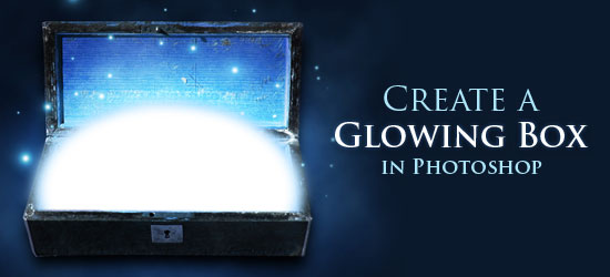
How to Make a Stylish Glowing Box in Photoshop

How to Make a Stylish Glowing Box in Photoshop


In this Adobe Photoshop graphic design tutorial, we are going to create a magical glow effect coming from a box in Photoshop. This is a pretty simple effect that looks great and can easily be adapted for use in other ways.


Final Result


Here is what we’re going to try and achieve. See the large full-scale version by clicking on the image.


Final Result


Download and set up the stock photo


1 Lets go ahead and get our stock photo. You can download it here. Open it up in Photoshop.


No we want to straighten out the box so click and hold down the Eyedropper Tool in the Tools panel, and then click on the Measure Tool (also known as the Ruler Tool).


Download and set up the stock photo


2 Now click and drag a line so it follows the bottom edge of the box. Go to Image > Rotate Canvas > Arbitrary. Don’t change the number, click OK. This will straighten out your box.


Download and set up the stock photo


Now go in and crop the document so there are no white edges showing.


Cleaning up the stock image


3 Since the light source is going to be from the inside, our shadow is going to be different that how it currently is. So, we are going to get rid of the shadow on the cover.


Use the Marquee Tool and select a part of the bright area, then bring that selection into a new layer (Ctrl + J). Bring it over to the left edge and fit it in the corner. (If you use Ctrl + T to transform the layer, then control and move the corners of the box it will skew them to get a better fit.)


Cleaning up the shadow


4 Add a layer mask by clicking on the Add a layer mask button at the bottom of the Layers panel, and use a soft black brush to mask out the right side of the highlighted area we just duplicated (the middle area of the box).


Layer mask


Play around with it until you get a smooth transition between the two layers and so there aren’t any duplicated areas.


<5 Now link the two layers.


Merge layers.


Merge them together, Layer > Merge Layers (Ctrl + E).


6 Now we are going to take another selection, this time grab a selection of the entire width of the brighter area we just made. Bring the new selection into a new layer (Ctrl + J). Then blend the new layer like in step 4.


Duplicate layer.


Use the Clone Stamp Tool (S) by first Alt + clicking on an area you want to clone from, then painting the area that needs to be cloned.


Cutting out the box from our stock image


7 Now we are ready to cut out the box.


Go in and use the Pen Tool to cut out the box and bring it into a new document. Use 1680 x 1050 px for its dimensions. Size it down to around 30%.


Pen Tool.


Creating the background


8 Let’s work on the background. Pick a dark blue color and fill the background (Ctrl + Del).


Background.


9 Grab a lighter version of that color, create a new layer (Ctrl + Shift + N) and create a radial gradient.


Lighter version.


10 Transform the gradient (Ctrl + T), bring it under the box then stretch and squeeze it so it fits like so.


Glowing Box.


Darken the box


11 We are now going to darken the box. Open up the hue/saturation window, Image > Adjustments > Hue/Saturation (Ctrl + U). Change your setting like I have them below.


Darken the box.


Open up the Curves window, Image > Adjustments > Curves (Ctrl + M) and change your settings to something like what I have.


Putting in the glow


12 Let’s put the glow in the box now. Using the Elliptical Marquee Tools draw a circle so the side edges of the box touch the inside sides of the box.


Glowing


13 Select the circle layer by using (Ctrl + Right-click) circle layer and create a new layer (Ctrl + Shift + N). Fill the area with a light blue. Make sure the white circle is the top layer. Click on the white circle layer and transform the circle using Edit > Free Transform (Ctrl + T). Hold down Shift + Alt shrink the circle.


Select the circle.


14 Now to give it a glowing look we are going to blur the edges of both the circles. First click on the blue circle layer and then go to Filter > Blur > Gaussian blur. Do the same thing with the white circle.


Glowing


15 Link the two circles together (click the empty box to the left of the layer, then merge the layers, Layer > Merge Down (Ctrl + E) to merge the two layers.


Now use the Polygonal Lasso Tool to make a box around the bottom part of the circle that isn’t inside the box and delete it.


Link the two circles.


Creating the outer glow


16 Now we are going to add an outer glow to the circle. Click on the "Add a layer Style" button at the bottom of the Photoshop Layers Panel and select Outer Glow. Adjust the settings like I have them. The color is going to be R: 190 G: 239 B: 255.


Outer glow.


17 We are now going to make another radial gradient using white as our color. Put the layer behind the glowing circle and stretch it out so it covers the whole width of the box.


Radial gradient.


Change the Blending Mode to Overlay. Now duplicate that layer by right-clicking on the layer and selecting Duplicate Layer… in the dialog box (Ctrl + J) to make it brighter.


Adding in the details (floating particles)


<18 Create a new layer (Ctrl + Shift + N).


We are going to create some particles floating off the glow. Click on the Brush Tool (B) and get a brush with 0% hardness, around 20 px. Pull up the brush settings (F5).


Particles 1.


19 Create a new layer and start painting on a few particles until you get something you like the following. You can adjust the size of the brush and experiment with its settings to get the desired effect.


New layer.


20 Now go into your layer styles and change your outer and inner glows to what I have below. Drag that layer just below the circle layer.


Inner glows.


Giving the box a drop shadow


21 We are going to give the box a little bit of a shadow. Click on the box layer and duplicate the layer (Ctrl + J). Use Ctrl + Right-click on the new layer to select it, and fill it with black #000000.


Drag it below the box layer.


Go to Filter > Blur> Gaussian Blur and change the setting to 12.4. Click OK. Now bump the shadow down a little bit.


shadow.


<22 Click on the Elliptical Marquee Tool, change the feather to 100 px and draw a circle around the box.


Make sure that your foreground is black (#000000) and the background is white (#FFFFFF), then go into Filter > Render > Clouds. Change the Blending Mode of the layer to Soft Light and the opacity to 70%.


Finished!


There you have it, a magical glowing box. I’m going to put my logo in and we are finished!


Finished!


If you do the tutorial, be sure to link to your version in the comments, we’d love to see your rendition!


If You Like My Post Comment Me,Thanks You And Visit Again

Read more...

Followers

Action

Mesothelioma Cancer
ThemeFlash Msn bot last visit powered by MyPagerank.Net Creative Commons License
 

ThemeFlash : The Quality Web Resources. Copyright 2009-2010 All Rights Reserved Revolution Two Church theme by Brian Gardner Converted into Blogger Template by Bloganol